Alas, Poor Yorick!
Anyone interested in information design and bureaucratic instructions should note the recent redesign of the labels of prescription medicine bottles by artist Deborah Adler of Milton Glaser for retail behemoth Target. (Even printed warning labels on common products such as toothpaste and diapers can contain surprisingly counterintuitive information.) Adler said that she redesigned the bottles after her grandmother mistakenly took medication intended for her grandfather.
In contrast, the official guidelines on the website of the Food and Drug Administration were appallingly illegible, even on "new" over-the-counter labels. So many children die needlessly of Reye's Syndrome after taking aspirin to treat the symptoms of chicken pox, not enough can be done to improve the clarity of warning messages.
The www.fda.gov website has some other rhetorical idiosyncracies of note:
1) The dangers of birth control always get a prominent place on their virtual masthead.
2) The government information office in Pueblo, Colorado is still in business and will send you hundreds of booklets for free. (This was an outfit much beloved in my pre-WWW youth.)
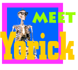
3) The mascot for the children's page of the FDA is a loveable skeleton named Yorick!
In contrast, the official guidelines on the website of the Food and Drug Administration were appallingly illegible, even on "new" over-the-counter labels. So many children die needlessly of Reye's Syndrome after taking aspirin to treat the symptoms of chicken pox, not enough can be done to improve the clarity of warning messages.
The www.fda.gov website has some other rhetorical idiosyncracies of note:
1) The dangers of birth control always get a prominent place on their virtual masthead.
2) The government information office in Pueblo, Colorado is still in business and will send you hundreds of booklets for free. (This was an outfit much beloved in my pre-WWW youth.)
3) The mascot for the children's page of the FDA is a loveable skeleton named Yorick!

Labels: government websites
posted by Liz Losh at 11:34 AM
![]()
![]()

1 Comments:
I liked learning more about the process behind the product, and was intrigued to learn that the new prescription bottle came out of a Masters thesis. I posted something on our blog, www.design-your-life.org. There has been a lively interchange about it.
Post a Comment
<< Home